
You can say it all you want, but if they don’t see it, they won’t care.
The statistics are clear in their message – people respond to visuals. Illustrations increase engagement by approximately 323% and marketers all across the world swear by the importance of strong graphics. The numbers don’t lie, and every element of your marketing visuals have got to be top-notch to help you succeed.
So, you can bet that choosing the best color combinations for your brand and your website is a huge decision, and yes, sometimes an overwhelming one.
But don’t worry, we’ve broken it all down for you.
Let’s look into what you need to consider before choosing your colors and then, what some of these colors represent.
Choosing the Best Color Combinations for Your Marketing Strategies
Whether it’s your site, your social media or your product packaging, you need uniform colors to represent your brand. It signifies brand consistency and reliability, so it is absolutely essential that your key brand colors are incorporated in your web-designs, content, and everything in between.
What do you want your audience to understand? What do you want their initial perception to be? You need to know what message you want to get across, before choosing your color schemes.
Every color sends a message. It could be joy, reliance, sophistication and a thousand other things. The right combination of colors can speak volumes to the sub-conscience and not-so-sub conscience of your customers.
So, for our next step, let’s understand what those could be.
1. Shades of Blue
Blues generally give off a crisp, friendly and dependable impression. It implies professionalism, efficiency, and fluidity. It also doesn’t hurt that being the most popular color in the world, makes it very pleasing to most eyes.
2. Dark Sophistication
Dark colors generally have a bad reputation. You might perceive it as closed-off, broody and aloof. But, there’s a way to make it work. Black can actually look remarkably sophisticated, sleek and classy.
It works especially well with car brands, liquors and things of that variety. It can create this impression of being exquisite, unique and truly luxurious.
3. Caught Red Branded?
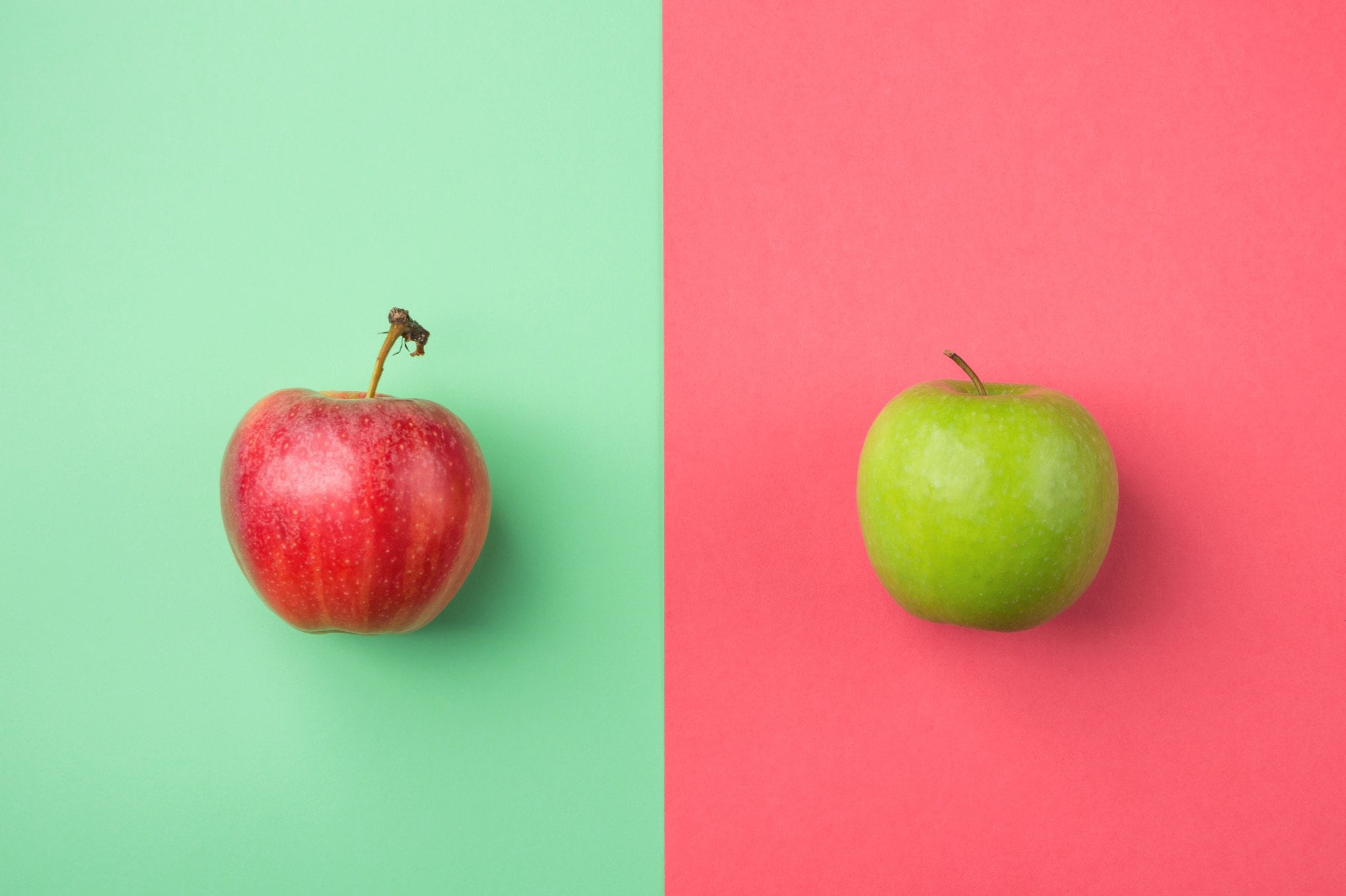
Red is bold; red makes a statement.
If you want a flashy, vibrant effect, reds or other bright colors are the way to go. This could work great for some brands, but some might prefer a more low-key approach to their marketing.
Could it work for cosmetics? Yes. Banking? Probably not.
4. Going Green
Fresh, vibrant and soothing. There’s something incredibly charming and peaceful about greens, people immediately associate them with wholesome thoughts.
Does your brand represent this kind of pure, unadulterated goodness?
The Big Picture
Good branding is all about the overall impression. Its the combination of dominant colors, complementary colors, backgrounds and the design you’ve created. If at the end of it all, your website inspires the perception you intended, then you’ve done a great job.
If it doesn’t, analyze what’s missing. Explore how you feel about the details and make your tweaks until you have the best color combinations for your designs.
Need inspiration or a helping hand? Check out our portfolio to see how we’ve incorporated these principles into our own work!