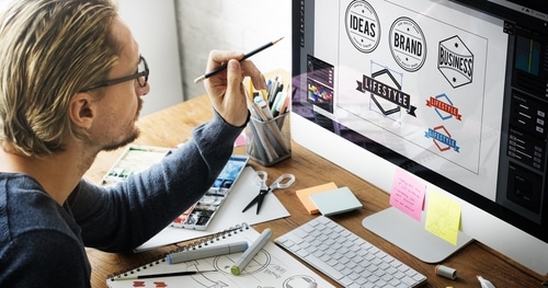
Whether you want to redesign your logo for the New Year, or you’re at the first stages of having one designed for your brand, there are a few elements you’ll want to consider. You wish to have those timeless aspects like the Nike swoosh and the Apple with a bite missing, but you also want to think about what’s trending and eye-catching right now. Even the big brands will spice up their design with trending colors, fonts, and current inspirations. Here are a few trends to look for in logo design in 2016.
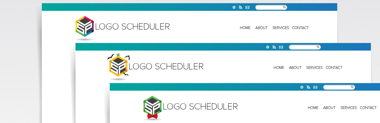
Vibrant Colors
Did you love the 80’s and 90’s? Well, then you’re in luck when it comes to the colors that will be used in logo designs in 2016. If you have a current logo design that needs a boost, you can keep the same curvatures and add a bright background color or a bold outline to the design. New designs will incorporate these lively colors helping the logo stand out and be quickly accepted by multiple generations of people. If you love the retro colors and designs of the 50’s and 60’s though, don’t worry, they’ll still have a strong presence.
Fun Fonts
Font styles are getting more creative and adaptive as technology improves and people demand more. You have a lot of new and exciting fonts to choose from when it comes to your logo design, so take the time to look at what’s available. It’s pretty impressive the difference the typography can make in how your brand is perceived. It can show playfulness, seriousness, and the overall attitude the company is trying to portray.
Originality
It can seem to some of us that it’s all been done, but when it comes to logo design trends in 2016, we’ll see some originality come through. Businesses will want to showcase their entire cause in the logo and may do that with a picture as large as an infographic. In the past, we’ve seen quaint and simple designs, but this year we’ll see the emergence of larger images to set your logo and brand off. While there will be more elements involved in this style of logo, it will still be very appealing to the viewer.
Layers and Shapes
You’ll still see those flat logo designs that you’re used to in 2016, but the layers will be more intricate, and the shapes will be more dynamic and shifting. These shapes and layers will allow the logo design to pop off the page. In turn, they will be fun to look at, and it won’t be long before you immediately associate the logo with the brand (which is the point of having a great logo). Focus on various curves and lines that work together in unison, and you’ll be moving in the right direction.
Custom Photography and Illustrations
Over the last year or two, we’ve seen stock photos and illustrations go to the wayside. Logos deserve that extra care of custom elements that will be one hundred percent unique to your company. While this also falls under the category of originality, it deserves its own mention because a custom logo will be your best bet in 2016.