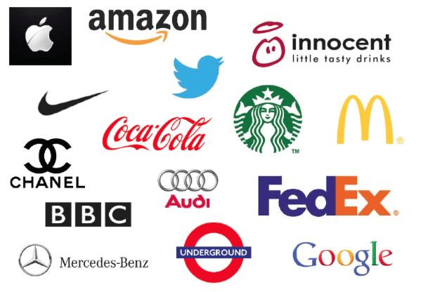
Your logo represents your brand. It can be the attraction point that draws a new customer in or a steady reminder to who you are and what you are all about.
It is vital that all aspects of the logo are thought out prior to a final decision. One of the most important factors to consider is logo color and the knowledge that color matters.
Let’s review some of the best colors for a logo.
The Psychology of Color
Color has an impact on our behaviors and our interest. The attraction differs from color to color, but the right combination for your brand and product will draw in the customers in record numbers.
When it comes to logos, there are a few tried and true colors. The list includes blue, red, silver/black, and gold/yellow. These colors are used in the top 100 most recognizable brands.
Blue ranks as one of the best logo colors. It represents control, calm, honesty, freedom, intelligence, and confidence. Using blue in your logo inspires trust and credibility. In a study done it was reported that a Honda dealership increased sales by 35% by choosing blue as the color for final negotiations.
Red is very popular, but can also bring out negative thoughts. While it represents passion, strength, energy, and love, it is also used to express anger, stress, and war. It is known to spike impulses, whether buying colors or even food. It is often used with yellow or white; such as with Levi, Coca-Cola, Lays, and even McDonalds.
Silver has an elegant feel and speaks to grace and wealth. As a logo color, the metallic look makes it a good fit for technology and industry. Black is known as a symbol of power, luxury, mystery, and control. It can also bring up thoughts of grief, so it should not be used in the food industry or in any business dealing with families.
Gold is the color that represents wealth, prosperity, royalty, luxury, and glamour. It can also bring a feeling of warmth and acceptance. Yellow shows confidence, encouragement, and optimism. It is seen as cheery and positive. It works well with baby products, sports, and even entertainment. Both of these colors can be overpowering, so be careful not to use either too prominently.
Look here for tips on increasing your Instagram traffic.
Keep it Simple
It is a good idea for your logo colors not to look like a rainbow. Blending in too many colors is distracting and will confuse the consumer. It is best to use no more than two colors in your logo.
There are examples of famous logos that use many colors, but the best rule of thumb is to stay on the safe side with just a couple.
The question often comes up about using the company name in the logo. The possibilities are endless, but the key is minimalism. You do not want your logo to be so busy that it detracts from the message you wish to convey.
In addition to a great logo, your website needs to stand out. Here is how to design a unique website for your brand.
Best Colors for a Logo
Brand identity is important. Having a strong logo will help you shine in the marketplace and set your niche. Color is a powerful indicator of how well the logo, and subsequently, your business will succeed.
For information and help with your logo, and all your website needs, contact us.


