78% of consumers — and likely many business owners — believe that logos are works of art. This, however, couldn’t be further from the truth. There are clear sciences involved in creating a logo design.
Beauty in good design is a result of the process, whether it’s creating a supersonic jet design or a logo rebrand. Very functional things tend to be inherently beautiful.
Are you creating a logo and want to avoid making serious logo design mistakes? Keep reading to make sure your logo design company isn’t designing a logo like this.
Skipping Design Steps
Like any other job with recipes, like chemistry, if you skip a step you will end up with something very different than what you expect.
Very rarely it ends up being a new revelation — like nylon. Usually, it ends up as a toxic cloud, like mustard gas.
The moral of the story is, do not skip design steps!
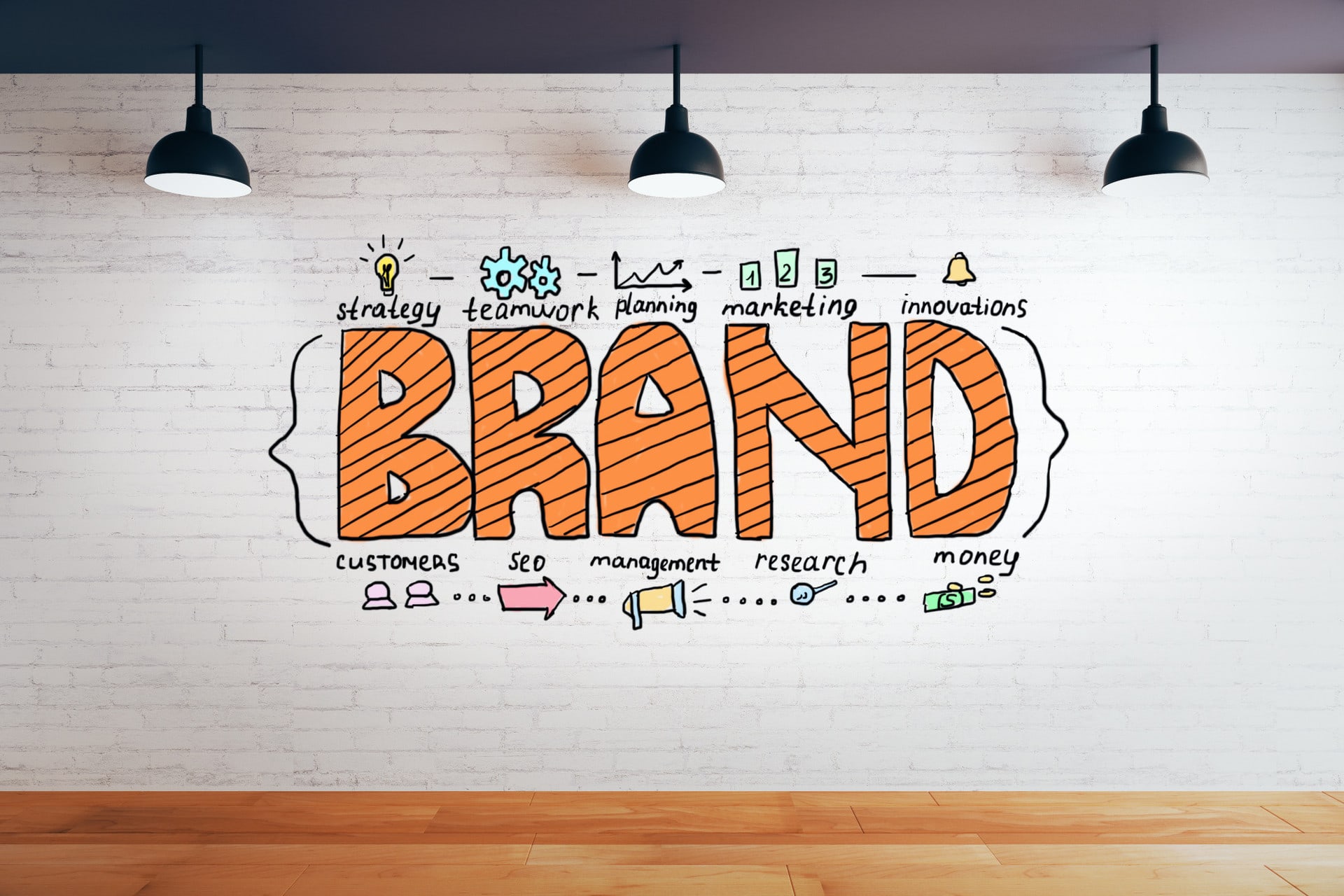
Find the Core of Your Concept
Finding the core of your concept is the first step. You’ve no doubt seen many pediatric facilities and church logos with the concept of “caring for the young” represented visually.
If your logo design company hasn’t designed according to the core concept of your business or industry, any visual element you make will be useless and inconsequential. You might as well draw a triangle or square and put your company name next to it as Gap did.
Not Considering Composition
Now that you have your concept, the composition is next. Going back to pediatric facilities and church logos, the composition is very important. If you look at logos like this, many have tried to create a “flat” design of a three-dimensional element.
Doing this kind of “z-axis flattening” composition, you lose vital details. Ultimately, many pediatric centers and church logos end up looking inappropriate and suggestive, rather than creative or communicative.
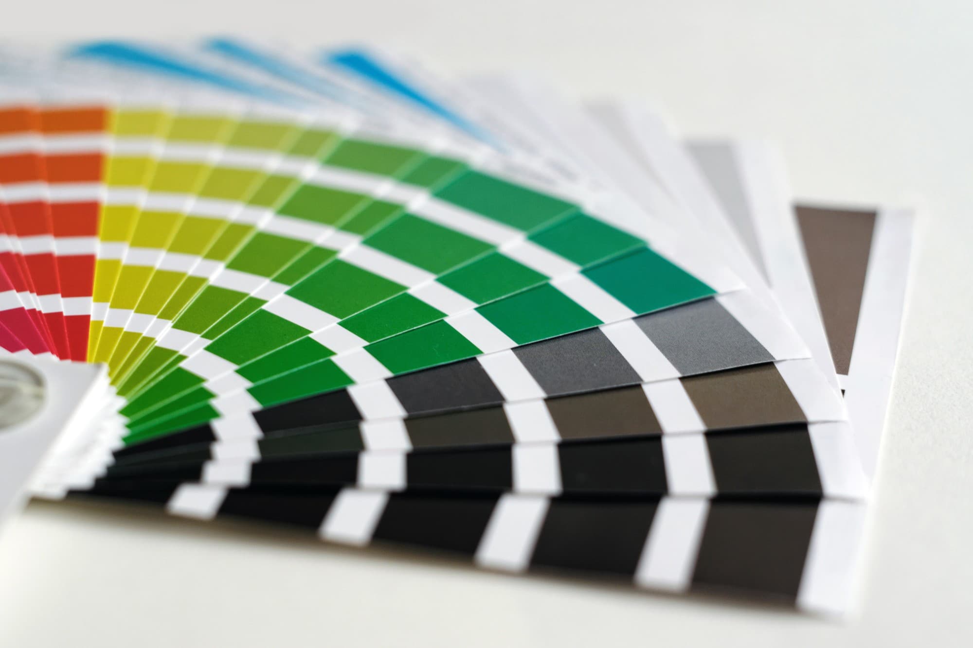
Don’t Design in Color
If your designer is doing more than humoring you with proposed color palettes stop them in their tracks. Any logo design service worth its salt that designs logos in colors other than black and white should start from the beginning.
If you can’t read a logo in black and white, it shouldn’t be read at all. Go back to the drawing board.
Slapping On Text at the End
Text isn’t something to be slapped on at the last second with a fancy script font. Text is an integral part of the logo from the start. The text itself can be the logo.
Often, while working on text and composition, a logo from within the word forms themselves will jump out. This can culminate in a recognizable shape for your customers to latch onto and a later subsequent original logo could come from it.
Confusing Impressions
If you’re a luxury goods store you don’t want to look like a dollar store or family dollar. Conversely, if you’re a corner grocery store it doesn’t make sense to put a luxury sign up unless your goods are high-end.
You want to attract your target group without excluding others, but you don’t want to confuse them. When you’re creating a logo, you want it to match a customer’s expectations.
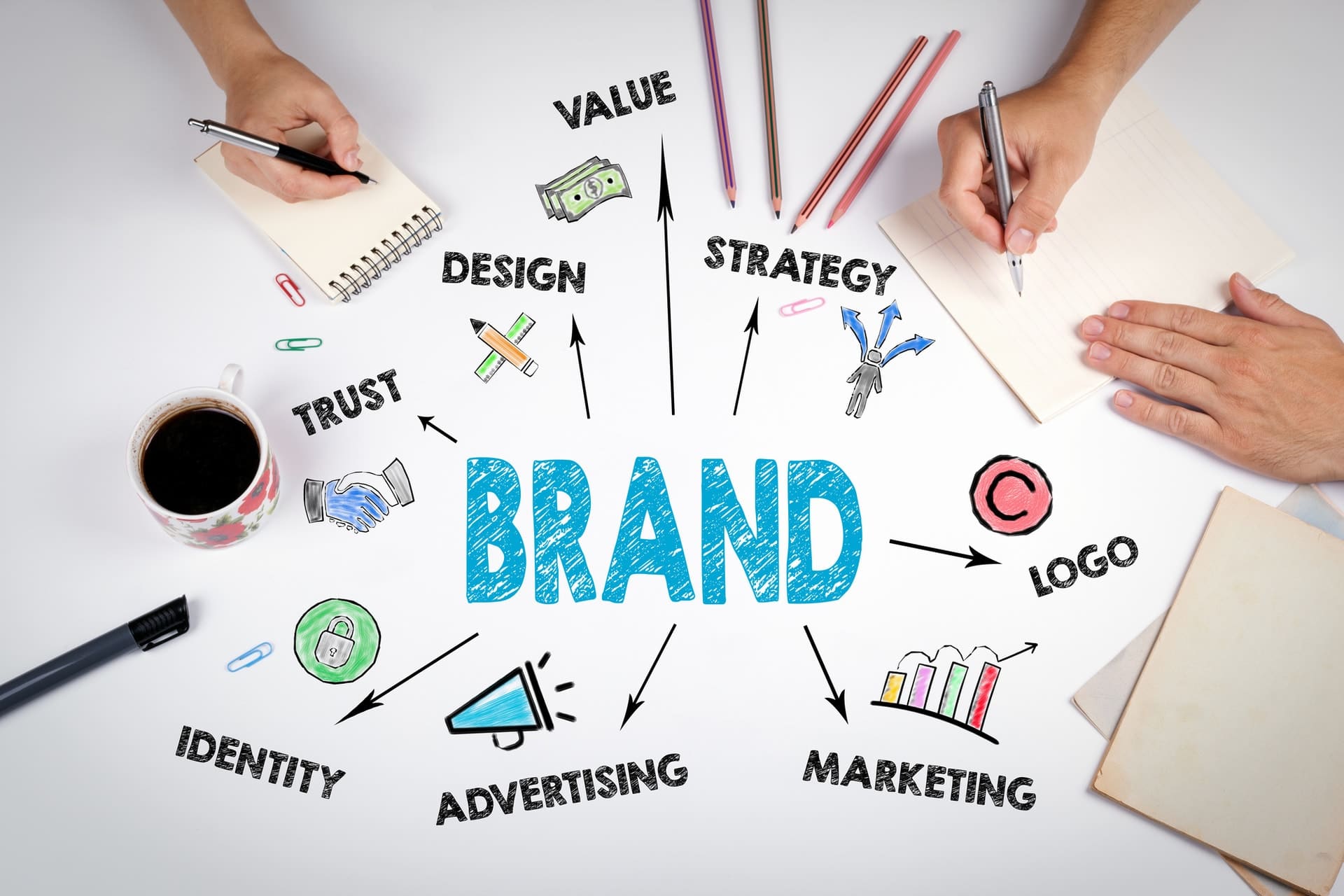
Logo Design Mistakes: Designing a Logo Isn’t Art
The biggest logo design mistake of all is believing that logos are subjective and that they’re art.
You might not even like your logo but the owner isn’t the target customer. Make sure you’ve targetted the right people, your customers.
All My Web Needs has over 150 years of combined work experience at our disposal. We’ve been operating in Nashville, Tennessee since 2009, and know what it takes to make your business a success.
Contact us to get started on your next logo design!